
The Stories Behind the Canvas

Redemption
Started over forty years ago and only recently completed, Redemption is a deeply symbolic piece drawn from the imagery of walking through a forest after a fire.
-
Started over forty years ago and only recently completed, Redemption is a deeply symbolic piece drawn from the imagery of walking through a forest after a fire. At first glance, it speaks of death, destruction, and the passage of time—withered roots, charred remains, and the long shadow of loss. But look closer: the horizon breaks with light, a single flower blooms defiantly, and the path winds forward. This painting is a meditation on forgiveness, regeneration, and the enduring possibility of new life, even when all seems lost.
-
The painting was originally begun in the early 1980s, then set aside for decades. Returning to it years later allowed a new perspective to emerge. Built in layered watercolour and ink, the image was developed slowly—tree by tree, texture by texture—until the contrasting themes of decay and renewal could speak with equal force.
-
Redemption invites contemplation on the painful beauty of healing. Viewers have described feeling drawn into the path as if part of their own story were written in the landscape. It reminds us that even after ruin, something tender can still grow—and that hope, though small, can hold extraordinary power.
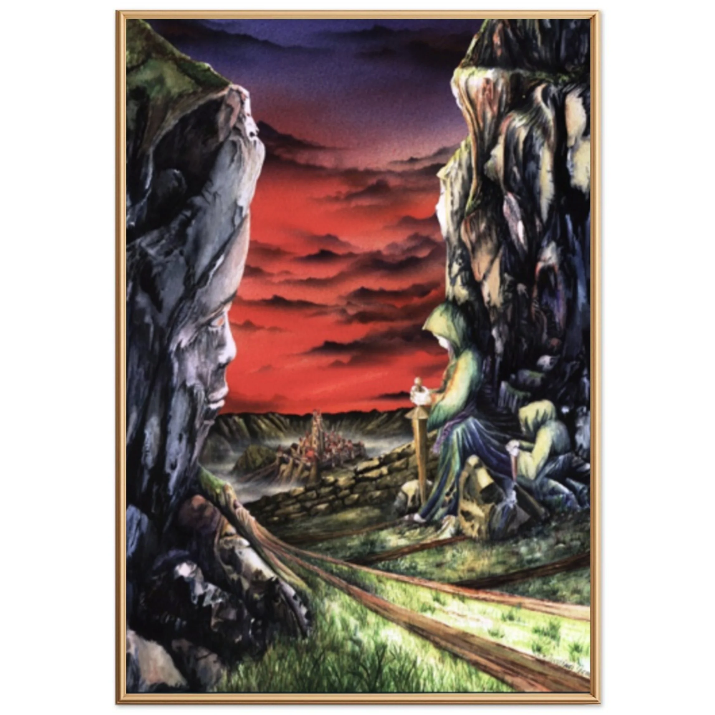
Aragorn
Inspired by Tolkien’s tale of destiny and courage, this layered landscape honors the quiet strength of a hero who must rise to redeem a world lost in shadow.
-
A path winds between towering rock faces—each alive with hidden forms and knowing eyes—toward a distant stronghold under a sky ablaze with crimson clouds. Inspired by Tolkien’s enduring tale, this painting draws from the mythic journey of Aragorn, a reluctant heir who rises to meet his destiny. The cloaked figure sits quietly, sword grounded, not in triumph but in reflection—embodying the burden of leadership, the call of purpose, and the quiet strength that shapes a king. As with many of my works, the landscape itself conceals layers of story: trickery of light and shadow, forms shaped by fate. It is a scene not just to be viewed, but explored—an invitation to search, wonder, and hope.
-
This painting was created using watercolour on rough-grain paper, combined with airbrush work for the sky. The texture of the paper was essential—it gave the shadows their unpredictable depth and allowed the forms to emerge organically. The process spanned several months, as the composition slowly revealed itself. Inspired by Tolkien’s world but not bound to any one scene, the imagery came intuitively, shaped by reflection, memory, and emotion.
-
At its core, this painting was a gift—created not as a commission, but as a gesture of shared storytelling and connection. It was born from a family tradition of giving something made by hand rather than bought.
Beyond the personal, Aragorn carries deeper themes: the tension between power and humility, the burden of leadership, and the resilience of good in a world shadowed by doubt. Like Tolkien’s stories, it reminds us that true strength often lies in the quiet resolve to do what’s right—especially when no one is watching.

Inner World
A haunting image of solitude and stillness, where the inner self clings to light amid the madness of a fractured world.
-
Suspended in a dreamlike space, a solitary figure curls atop a glowing sphere—part pearl, part planet—encased in jagged, crystalline structures. Around them, a fractured world unfolds in shifting hues of violet and grey, evoking the feeling of being still in the centre of chaos. Painted in the wake of deep personal loss, this piece captures a moment of profound inwardness—where silence speaks louder than words, and the mind retreats to its most private terrain. Here, thought becomes landscape, and solitude becomes a form of survival.
-
Created with a combination of airbrush and fine sable brushwork, this piece merges soft transitions with intricate architectural detail. The figure is airbrushed in silhouette, seated atop block-like structures meticulously painted by hand. The palette was chosen to reflect contrast: turbulent, thunderous clouds give way to an eerily still sky—mirroring the emotional duality at the painting’s core.
-
This piece emerged from a time of inner and outer chaos. While inspired in part by the rolling hills of Wales, its real terrain is psychological. It explores what it means to be emotionally overwhelmed yet strangely detached—to find yourself alone in a crowd, seeking peace in an unquiet world.
Many viewers feel drawn to this piece, as if it mirrors something quietly unresolved within themselves. It is both isolating and strangely comforting—an echo of the places our minds sometimes go when the world feels too loud.

The Cross
A surreal vision framed by myth and mystery, where divine symbolism meets an untamed shoreline at sunset.
-
Emerging from the mists of memory, this enigmatic piece invites contemplation more than explanation. At its heart, a golden globe bearing a cross hovers between two mythical guardians—a sinewed, horse-like creature and a bird in poised descent—each entwined in a graceful descent toward a rugged coastline. The frame they form leads the viewer down through rope-like strands into a landscape shaped by time and tide, where a solitary sun slips below the horizon. It’s a moment suspended between conflict and calm, divinity and the earthbound, mystery and meaning.
-
This piece was painted entirely by hand in watercolour, combining delicate line work with soft gradients to evoke stillness. The framing was conceived as a symbolic device—part myth, part imagination—encircling a seascape rendered in muted greys and faint blues to contrast the warmth of the sinking sun.
-
There is a strange stillness in this piece. The shoreline seems almost untouched by time, and the symbolic figures—though curious and surreal—lend a kind of reverence to the scene. Some viewers feel a tension between the earthly and the divine, while others sense quiet peace, as if the world were momentarily at rest. It invites inward reflection—on guardianship, faith, and what lies just beyond the visible.

Ouroboros
A surreal meditation on time’s endless cycle, framed by ancient symbolism and natural beauty. Beneath the serpent’s coil, lilies and pomegranates whisper of love, purity, and divine promise.
-
Encircled by the ancient serpent devouring its own tail, this piece invites the viewer into a world where beginnings and endings blur—a meditation on the cyclical nature of time. The path winds through mountainous terrain beneath a radiant sky, framed by calla lilies that whisper of purity, humility, and enduring love. At the serpent’s base, pomegranates—symbols of abundance and divine promise—anchor the scene in sacred fruitfulness. This surreal portal suggests that what lies beyond is not only another place, but another way of seeing.
-
Painted in fine watercolour over several sittings, this piece was created under a magnifying glass to bring out layered detail and hidden symbolism. The ouroboros was drawn freehand, then layered with allegorical elements such as lilies and pomegranates using fine brushwork and light ink washes.
-
The piece reflects the cyclical nature of time and the quiet persistence of hope within that cycle. Viewers have interpreted it as both sacred and surreal—a meditative space filled with symbols that invite contemplation rather than conclusion.

Hope (Breaking Free)
A dark inner world, pierced by a fragile yet powerful promise: the possibility of rebirth and light beyond the shadows.
-
A cavernous mindscape, shadowed and scarred, closes in with silent weight. Figures seem etched into the walls—echoes of fear, trauma, and internal battles—while even the side room offers no refuge, only more of the same. In this claustrophobic space, the air feels thick with resignation. Yet at the far end, something stirs: a tear in the darkness, a cocoon cracking open, and through it, a glimpse of bright landscape bathed in light. Hope (Breaking Free) is a meditation on despair and renewal—a reminder that even in the deepest internal prisons, the possibility of transformation remains.
-
This painting began with the stark geometry of a confined space—walls, ceiling, and jagged corners drawn in watercolour and deepened through airbrush shading. The figures in the walls were not planned but emerged as the painting progressed. The floor’s reflective surface and the fractured rear wall, showing an almost unreal landscape beyond, were added late in the process. These elements created a powerful contrast between claustrophobia and escape, between the prison and the possibility.
-
This piece emerged during a period of personal upheaval. At its core is the feeling of being trapped—not by others, but by the weight of one’s own inner struggles. The room is not just a place but a mindset, haunted by memories and isolation. Yet, despite its darkness, this is not a painting of despair. It is about a breakthrough—the moment the cocoon splits, the mind shifts, and healing begins. The light doesn’t storm in; it seeps. And in that, there is quiet, persistent hope.

The Bridge
A symbolic clash set in a treacherous landscape—this painting reflects the tensions of choice, conflict, and the difficult paths we walk.
-
Conflict is etched into the landscape here—two looming forms face each other across a jagged span that serves as both battleground and bridge. At the heart of the painting, an unintended face seems to emerge from the terrain, watching silently as the path twists through treacherous rock and shadow. Created in a time of personal upheaval, this piece draws from the starkness of wild places—those you walk with aching limbs and racing thoughts. The Bridge is not a declaration but a question: about choices made, directions taken, and what it means to stand in the middle of a moment, caught between what was and what might have been.
-
Created at A0 scale, this work is a detailed fusion of fine hand-painted watercolour and atmospheric airbrush. The terrain is distinctly shaped by the British countryside, with its raw, unpredictable beauty. The sky and distant tones were laid first with airbrush, but the deeper textures and layered details emerged slowly—often unexpectedly—over the course of a year. The process was intuitive, revealing hidden elements as if the painting was telling its own story. Like many of my works, it evolved well beyond its original vision, shaped by what was felt as much as what was planned.
-
This painting speaks of inner conflict—those turning points when past and future collide, and we hesitate on the brink of choice. The two confronting figures may be enemies or twin aspects of the same soul. The path beneath them is no safer going forward than returning. The sky bleeds with red, the cliffs look on in silence, and a face, unnoticed at first, watches from the rock itself. The Bridge invites us to ask: What do we face when we confront ourselves? And who are we when no one yields?

Harmony
A serene portrayal of love in perfect sync with nature, where human connection echoes the peaceful landscape beyond.
-
A moment suspended in stillness: two lovers rest, entwined not only with one another, but with the world beyond the walls. Through the window, soft hills and calm water mirror the curves and flow of the bodies within, blurring the boundary between human form and nature’s design. The sky is quiet, the light gentle—an invitation to breathe. Unlike the conflict and inner struggle of other works, Harmony offers something rare and healing: a vision of love as alignment, a unity of body, spirit, and landscape.
-
This large-scale painting was constructed slowly over time, with many layers hidden beneath the final form. The figures and interior were rendered in detailed hand-painted watercolour, while the exterior view—framed like a painting within the painting—was airbrushed for softness and clarity.
Where many of my works rely on rough-textured paper to reveal hidden patterns and meanings, this one is more sculptural in feel—focused on light, shape, and fluid connection. -
This piece is a quiet celebration of intimacy—not just physical, but soulful. It is about the stillness found in deep connection, when two people are so attuned they seem to breathe with the same rhythm. The hills outside echo the lines of the bodies within, suggesting that true love is not separate from the world, but in tune with it. In this moment of peace, even time seems to pause.

Mooncast
Inspired by moonlit mountain walks, this serene and mysterious landscape invites quiet reflection beneath a silver sky.
-
There are nights in the mountains when the moon holds the world in quiet awe—casting shadows so sharp, so luminous, they seem to reveal a hidden realm. Mooncast draws from such moments: the hush of high places under starlight, the eerie stillness, the subtle suggestion that one is not alone. The jagged cliffs and winding paths become both stage and cathedral, where silent figures gather not to act, but to witness. Painted in tones that blur the boundary between night and dream, this is a meditation on solitude, wonder, and the strange beauty revealed only in darkness.
-
This piece is among my personal favourites, shaped through painstaking detail and patience. Much of the finer work was done under a magnifying glass to draw out the textures hidden in the rugged paper surface. The interplay of light and shadow revealed new shapes over time—many unplanned, but welcomed.
The sky, created using airbrush, includes a subtly fading sun, a streaking meteor, and the full moon, all layered to capture that ethereal atmosphere of a high-altitude night. The tonal balance was particularly challenging, but the result holds a stillness I sought to preserve. -
Anyone who has walked in the hills at night, with only the moon and silence for company, may feel an immediate connection to this work. It’s not simply a landscape—it’s a feeling. That quiet intensity, when the world seems to pause, and the ordinary becomes otherworldly. The rock seems to breathe, the shadows lengthen into presence, and even the cold air feels alive. Look closely, and you'll find silent figures gathered—perhaps spirits, perhaps memories—bearing witness to the mystery and majesty of the night.

Fine Artwork
An elegant reflection on the creative spirit—where grace, imagination, and craftsmanship come together in visual harmony.
-
A celebration of creativity, Fine Artwork brings together elegance, femininity, and a quiet confidence in the artistic process. The central figure—serene yet focused—holds a fine brush as if caught in a moment of reflection, her gaze drifting toward imagined possibilities. Surrounded by flowing fabric, delicate florals, and a palette of soft pastels, she embodies the harmony between art and identity. In the corner, a rural Welsh landscape is captured in miniature—a tribute to place, memory, and the versatility of the artist’s hand. A composition where form meets finesse, this piece invites viewers to pause and consider the beauty of thoughtful creation.
-
This was one of the more technically demanding pieces I’ve undertaken, blending meticulous watercolour brushwork with controlled airbrush gradients to soften and unify the scene. The figure, fabric, lettering, and floral details were developed slowly over time, with a focus on subtle transitions and harmony of form. The miniature landscape—drawn from the Welsh countryside near the southern border—is painted in a completely different style, offering contrast and context, and giving the painting added narrative depth.
-
Though born from a less-than-ideal commission experience, this piece stands as a symbol of artistic integrity. It reflects the pursuit of excellence for its own sake—regardless of outcome. The central figure, with her distant gaze and relaxed posture, captures a moment familiar to any artist: when reflection and intent quietly settle into process. There is a hint of nostalgia, a sense of personal pride, and perhaps even defiance—in the way she holds the brush and owns the space. This painting reminds us that beauty can emerge, even when beginnings are fraught.

Children of a New World
(also titled “After the Fire”)
An expansive vision of renewal and quiet hope, where two children stand before a reborn world—painted in intricate detail and deep reflection.
-
Spanning almost a metre in width, Children of a New World is the most expansive and intricate of my works—a painting I return to often, discovering something new each time. Inspired by the endless detail found in the natural world and painted largely under a magnifying glass, this landscape stretches far beyond what first meets the eye. Rolling hills, sculpted valleys, and a sky brushed with the remnants of a storm evoke a world that has passed through fire—and endured.
In the foreground, two children stand on the edge of this new beginning. They are based on my own twins—one fair-haired, the other dark—symbolising balance, renewal, and hope. Together, they face a world both changed and full of promise. This piece is not just a panorama of imagined geography—it is a meditation on healing, legacy, and the infinite beauty hidden in creation, if only we have eyes to see.
-
This painting challenged me more than any other. Created over several years, most of the detail was built up using the finest watercolour brushes under a magnifying lens. The sky, made of layered airbrush and soft hand blending, was particularly complex—its gradients revealing the subtle interplay of atmosphere and light we experience in a changing British climate.
There is no single focal point; rather, it is a tapestry of detail and colour, each brushstroke inviting the viewer deeper into the landscape. It is intentionally immersive—designed to be studied, not just seen. -
This piece is about beginnings—about finding beauty and meaning after difficulty. The children in the painting symbolise innocence, legacy, and the possibility of healing. They are observers, like us, standing before a world that has endured fire and emerged more vivid for it.
At its heart, the painting is a love letter: to nature, to imagination, and to my children. It is a reminder that creation, both natural and artistic, carries within it endless renewal.
This painting also holds a special place for me—it is the quiet origin of the name Beyond Canvas.
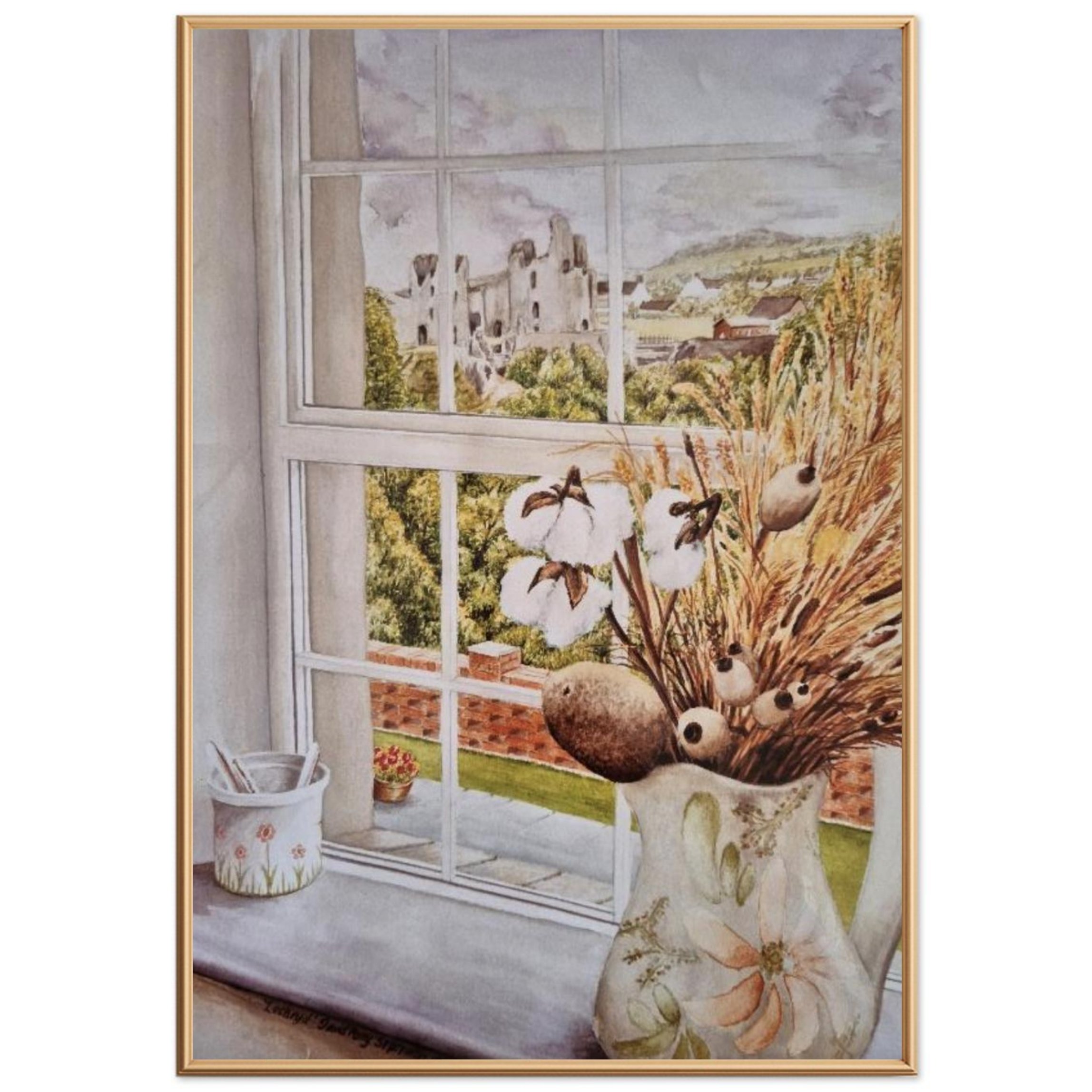
The Castle Cottage
A soft, nostalgic study of a quiet moment—where creativity, nature, and time-worn beauty meet across a windowsill.
-
A window into a quieter world. The Castle Cottage captures the simplicity and warmth of a moment spent indoors, gazing out across sunlit fields and crumbling stone walls. The soft arrangement of dried flowers and grasses in the foreground mirrors the muted tones of the landscape beyond, while a painted jug and brush pot hint at creative hands at rest. Though the exact place may have slipped from memory, the feeling remains—of stillness, reflection, and the gentle joy of noticing what’s right in front of us.
-
Painted entirely in watercolour by hand, this piece contrasts the precision of interior detail with the soft fluidity of the natural world beyond the window. No airbrush was used—only brushwork to evoke texture and light. The palette of dried grasses complements the scene outside, uniting interior and landscape in tone and form.
-
Imagine a late summer afternoon in a quiet Welsh cottage, far from deadlines or distractions. The light is soft, the air still, and the world feels momentarily suspended. This painting is an invitation to step into that space—to rest, notice, and be quietly inspired.

COURTYARD
A sunlit retreat framed in warmth and symmetry—inviting stillness, elegance, and Mediterranean calm.
-
Watercolour and Airbrush – A2 Size
Created as a private commission for a Mediterranean home, The Courtyard presents a peaceful sanctuary viewed through parted curtains—like a glimpse into a still, sunlit memory. At its heart is a circular pond with water lilies and a classical fountain, surrounded by red brick walls, elegant benches, and flowering plants. The scene is both idealised and grounded, inviting the viewer into a space of warmth, order, and contemplative beauty. This painting is less about place than feeling: a moment of stillness, bathed in sun, framed by quiet.
-
This piece was painted using a combination of airbrush and traditional watercolour techniques. The airbrush was used to achieve the soft gradients of sky and architecture, while the detailed elements—the lily pond, flowers, and curtain folds—were rendered by hand. Balancing precision and atmosphere, the painting was designed to evoke tranquillity and offer a sense of personal retreat.
-
The Courtyard speaks to the desire for sanctuary—a place apart from the noise of the world. Whether imagined or real, it symbolises the kind of space we seek when we long for rest and beauty. Viewers often describe it as timeless and meditative, like walking into a still morning or recalling the quiet joy of a place once visited and never forgotten.

AI (Before It Was a Twinkle in the Eye)
Painted in the early days of computing, this futuristic vision eerily anticipates a world watched over by the eye of technology.
-
Long before AI became a household word, this painting captured something uncanny—a world of machines, geometry, and shifting perception. In the foreground, cold metallic forms loom like early monoliths of the digital age: hard drives, server blocks, a CD-ROM glinting with spectral colour. Beyond them, a city flickers to life—its skyline reduced to circuitry and screen. And above it all, an unblinking eye rises like a new sun, watching. AI (Before It Was a Twinkle in the Eye) is a painting that foresaw what many didn’t yet sense: that even in its infancy, technology had already begun observing us.
-
This work predates any use of airbrush in my practice. Instead, the smooth gradients and softened forms were created using traditional watercolour "floating" techniques: pre-wetting the paper, tilting the board, and layering pigment with a soft sable brush to build depth and luminosity. The contrast between soft blends and sharp architectural structures adds a subtle unease to the composition.
-
At the time, I didn’t have a clear sense of what this painting meant. Only later did it begin to feel strangely prophetic—a world where technology is no longer a tool but a presence. The central eye, like a digital sentinel, suggests we are being seen, even before we realise it. There’s no clear judgment in this scene—just a quiet, enduring question: who is truly watching whom?

Buttermere – The Lakes
A poetic pause at the foot of a climb—this Lake District scene captures the calm before the ascent to Red Pike, where beauty hides just beyond the next rise.
-
This is the stillness before the climb—the soft curve of water and reeds at the edge of Buttermere, just before the path begins to rise toward Bleaberry Tarn and the heights of Red Pike, hidden beyond Dodd. Painted from memory and countless steps across the Lake District, the scene holds that familiar tension between peace and challenge, gentleness and grandeur. Red Pike, part of the High Stile range, marks the natural divide between Ennerdale and the valley below. Yet from here, it remains unseen—just as it does from the village—a reminder that the most powerful landscapes often lie just out of sight. A quiet tribute to the beauty of the Lakes, and the way walking them makes you feel both grounded and free.
-
This piece began as a series of quick watercolour sketches made while walking the shorelines of Lake Crummock and Buttermere. Back in the studio, it evolved into a larger work over several months. The soft layering of the sky was created using an airbrush to evoke the transient moods of Cumbrian weather, while the foreground and mountain detail were hand-painted in delicate washes and dry brushwork to retain texture and movement.
-
For seasoned hillwalkers or families skipping stones by the lakeside, this landscape resonates with a quiet kind of joy. There’s something universally restorative about this corner of the Lakes—where the light shifts constantly, the terrain surprises you, and nature seems to breathe beside you. This painting holds that moment of calm just before the climb, when you pause to take it all in, and feel both grounded and utterly free.

La Petite Auberge
A charming sketch that celebrates the spirit of Normandy village life—full of warmth, tradition, and everyday joy.
-
Drawn from a time of living in France, La Petite Auberge captures the quiet magic found in countless Normandy villages—where time lingers and life is lived with a sense of rhythm and celebration. Rendered in watercolour and ink, the scene radiates warmth: the textured brick, a planter spilling with greenery, a hand-painted sign swinging gently beneath the light. It’s a doorway, yes—but also an invitation.
Step closer, and you might hear music drifting from inside, or the laughter of children playing beside retired farm machinery during a village fête. These are places where food is lovingly prepared, crafts are made by hand, and stories are shared over simple pleasures. A tribute not to one village, but to the spirit of many, La Petite Auberge offers a glimpse of a life that feels both distant and deeply familiar.
-
This small watercolour and ink drawing was created from memory, not of one location, but of many—the typical bar crêperie or auberge found in small French towns. The pen and ink give it structure and life, while the watercolour softens the edges with the golden tones of stucco walls, terracotta tiles, and worn wood. It was painted quickly, in one sitting, to retain its looseness and spontaneity.
-
There’s a wistful kind of joy in this piece. You can almost hear the clinking of cutlery through an open window or imagine the village fête with its farm animals, old tractors, and games for the children. This isn’t just one auberge—it’s all of them, and the memories they evoke. In a world that moves fast, this painting asks us to pause, to savour the ordinary, and to remember how community, food, and laughter bind us to place and time.

The Welsh Dragon
and the American Eagle
A playful tribute to cross-Atlantic friendship and football rivalry—where myth and symbol meet with a wink.
-
Painted with a smile and a splash of sporting rivalry, this whimsical piece brings two national symbols face to face: the fierce red Welsh dragon and the proud American eagle. With flames (and maybe a little cheek) directed at its opponent, the dragon crouches in classic stance—ready, dramatic, and full of flair—while the eagle, cloaked in stars and stripes, stands unfazed. Created for an American friend ahead of a friendly youth football tournament in Wales, the painting captures a moment of light-hearted national pride and playful tension. Who won? That’s lost to memory—but the spirit of fun and friendship remains.
Step closer, and you might hear music drifting from inside, or the laughter of children playing beside retired farm machinery during a village fête. These are places where food is lovingly prepared, crafts are made by hand, and stories are shared over simple pleasures. A tribute not to one village, but to the spirit of many, La Petite Auberge offers a glimpse of a life that feels both distant and deeply familiar.
-
This piece was created using a combination of airbrush and fine watercolour detailing techniques, chosen to enhance both the intensity of the dragon’s red scales and the symbolic clarity of the American eagle. The stylised flames, exaggerated wings, and crisp national emblems lean into caricature with precision and humour. Though the concept was light-hearted, careful attention was paid to the balance of composition and symbolism, so that both creatures retain their distinct presence without overshadowing one another.
-
At its heart, this is a painting about camaraderie. Beneath the fire-breathing dragon and the steadfast eagle lies a shared love of competition and the joy of spirited encounter. Painted for the children of an American friend during a Welsh football tournament, the piece captures something more than sport—it captures the magic of youthful rivalry turned into memory. The dragon may snarl, and the eagle may glare, but there’s no malice—only mischief, and perhaps, a mutual respect hidden behind the theatrics.

White House Cameo
A nostalgic glimpse of a hidden country estate—capturing a young dreamer’s view of grandeur and promise.
-
Watercolour – A4 Size
This delicate watercolour was painted during the artist’s early years and later featured as a miniature within Fine Artwork, a larger composition. Inspired by a real location glimpsed from the road while travelling between South Wales and England, the painting captures a classical white house nestled in rolling countryside—half-hidden, half-dreamed. Its gentle hills, tree-lined drive, and luminous sky speak to an inner longing for place, possibility, and future homecoming.
-
Painted with transparent watercolour on fine-grain paper, this piece uses soft layering and tightly controlled brushwork to suggest atmosphere without overstating detail. The small scale required delicacy and patience, with special care given to line perspective and the luminous feel of the surrounding landscape. Although modest in size, the painting carries a timeless quality often associated with larger works.
-
The White House (Cameo) evokes a young person’s quiet aspiration—a moment of imaginative escape triggered by the passing view from a car window. For the artist, it came to symbolise both the unknown beauty of life ahead and the quiet wonder found in everyday journeys. Viewers have described it as peaceful, nostalgic, and quietly hopeful—a landscape where dreams first take root.
The Views Series
A departure in both style and surface, Views is a trio of airbrush and watercolour works exploring the flow of line, form, and memory through a more stylised lens. Each piece offers a framed perspective—a flower, a rose, a beach—yet all three are more than their subjects. With a nod to Art Nouveau elegance and graphic simplicity, the series reflects a quiet experimentation with space and mood.
From the gentle curves of a blue iris to the mirrored symmetry of a rose, and the saturated joy of a beach holiday frozen in time, Views invites the viewer to pause, breathe, and simply look. Together, the works form a visual exhale—a softened lens through which to see the world.

Blue Flower View
An elegant, airbrushed landscape that blends natural form and fluid line—born from artistic experimentation, rooted in love of place.
-
A gentle departure from my usual style, Blue Flower View is part of a small series created during a time of experimentation with airbrush technique and smooth surfaces. Simpler in line yet rich in flow, the piece still holds close to familiar themes: the calm of open water, the sweep of landscape, and the quiet beauty of nature in bloom. A single iris frames the shoreline like a memory curling back into view, its leaves stretching into the scene as if part of the wind itself. This is a painting of stillness and grace, where boundaries between frame and vista dissolve, and the eye is free to wander.
-
This piece was created using airbrush and watercolour on a smooth, coated surface—chosen deliberately to explore a new level of precision and control. The flowing curves and stylised floral motif were drawn freehand, then carefully masked and layered with soft gradients of colour. The entire scene was designed to merge elements of decorative art with traditional landscape, where structure and softness are held in delicate balance. The technique required patience and restraint, making this a meditative painting to create as well as to view.
-
walks and wind-swept days, where wild irises grow in defiant beauty against the elements. The boundaries between subject and setting are intentionally blurred—as if the flower and the view are one and the same. Blue Flower View invites reflection, not through dramatic statement but through the calm rhythm of line and light, shape and space. It’s a painting that offers rest for the eye and, perhaps, the soul.

Rose View
A serene and stylised meditation on nature, symmetry, and softness—part of a three-piece exploration in airbrush and form.
-
The second in a series of stylised landscapes created through airbrush and watercolour, Rose View blends natural form with a sense of gentle symmetry. A single rose, upright and poised, anchors the scene—its stem dividing soft hills that echo each other across a mirrored horizon. Petals bloom into a pink-hued sky, while the sinuous border curls like tendrils of thought or memory. Part floral study, part landscape, and part dream, this painting speaks to the quiet balance between strength and softness. It continues an experiment in minimalism and flow, offering space to breathe, feel, and reflect.
-
Like the other works in this trio, Rose View was painted using a combination of precise masking and airbrush gradients over a smooth surface, allowing for clean transitions and a polished finish. The symmetry was deliberately constructed—almost architectural in layout—yet softened by the flowing curves and gentle tonal shifts. The rose, drawn from a simple sketch, was positioned centrally to serve as both motif and axis, from which the landscape flows outward. Care was taken to balance both sides without making them identical, creating harmony without rigidity.
-
There’s a quiet, contemplative quality to this piece—an invitation to pause and find equilibrium in a world of constant motion. The rose, often a symbol of love or beauty, becomes here a quiet guardian of the horizon, rooted but reaching. The hills suggest distant memories or parallel lives, their mirrored curves softening into stillness. Rose View is less a scene than a feeling—an expression of inward balance, resilience, and the gentle unfolding of thought over time.

Beach View
A bright, playful homage to summer and simplicity—bringing bold colour and stylised charm to this three-part series.
-
The third in a three-part series exploring airbrush technique and stylised form, Beach View takes a playful turn. Gone are the sweeping hills and winding florals—in their place, a vibrant slice of summer: deckchair, sunglasses, cocktail, and surf. The beach is framed in stripes like a postcard or stage set, turning a simple seaside scene into something iconic, even a little surreal. At once retro and refreshing, this painting celebrates the joy of colour, the warmth of sunlit days, and the art of stepping away. A visual escape, framed with fun.
-
This piece was created using airbrush and masking techniques to achieve clean edges and bold flat colours—reminiscent of mid-century poster art. The striped backdrop was a technical challenge, requiring precise taping and layering to keep perspective aligned while softening edges just enough to create warmth. The forms were simplified intentionally to heighten their graphic impact, while the composition plays with scale to add a touch of surrealism—turning everyday holiday objects into focal points of fantasy.
-
Beach View is a painting about lightness—in spirit, in palette, and in mood. It invites the viewer to exhale and inhabit a different tempo, one where time slows to the sound of gentle surf and the clink of glass. The exaggerated framing and stylised objects add a dreamlike quality, almost like a memory that’s been sweetened with time. After the inward gaze of Blue Flower View and the reflective symmetry of Rose View, this is the exhale—a visual reminder of joy, leisure, and the art of simply being.
From My Daughter’s Sketchbook
While BeyondCanvas is a deeply personal expression of my own journey through art and storytelling, it has also become a quiet legacy—shared, in part, with my daughter Jessica.
From a young age, Jessica showed a natural creative spark. Her early experiments in pencil, ink, watercolour, and even lino cuts reveal a curious mind and a bold hand. Some of her work is raw, emotive, or playful—each piece capturing a moment of exploration rather than finality.
These sketches and studies are part of the fabric of this site—not as products, but as proof of something lasting: that art, in all its forms, can be passed down, reimagined, and born anew in the hands of someone you love.
Now an accomplished interior designer, Jessica continues to shape beautiful spaces with the same calm focus and artistic eye seen here. These early works offer a glimpse into the roots of her talent—moments of learning, reflection, and joy on paper.

Self Portrait
An autumnal self-portrait by my daughter Jessica—thoughtful, tender, and full of emerging creative energy.
-
A moment of quiet captured in ink and watercolour—this self-portrait, painted by my daughter Jessica as a young artist, reflects both introspection and emerging identity. Autumn leaves rest gently at her side, echoing the warmth in her hair and the quiet focus in her pose. There is simplicity in the lines, but also intention—a natural ease with form and mood that she continues to bring into her life as a talented interior designer. This piece marks the beginning of a creative path, painted in a season of change, with a heart full of promise.
-
Created using pen and watercolour on paper, this portrait balances fine linework with minimal washes of tone. The sweater’s textured strokes contrast with the simplified facial features, allowing emotion to emerge from posture rather than expression. Soft autumnal hues—seen in the leaf cluster and the warm tones in the hair—introduce subtle colour in an otherwise monochrome composition. The result is a portrait that feels both spontaneous and composed, youthful and timeless.
-
There’s a quiet strength in this piece—an introspective calm that invites the viewer into a private moment. The open book suggests curiosity or contemplation, while the fallen leaves hint at change, memory, or a season passing. Though drawn from life, it also reads like a symbol of creative growth: of someone grounded, reflective, and ready to shape the world through imagination.

Girl with Red Tears
A quietly powerful sketch that pairs restraint with emotion—leaving space for the viewer to interpret what lies beneath the surface.
-
A quietly haunting pencil portrait from Jessica’s sketchbook, this piece speaks more in what it withholds than what it reveals. The girl’s expression is calm, yet the vivid red streaks beneath her eyes suggest something deeper—pain, defiance, sorrow, or transformation. The contrast between the softness of the pencil and the sharpness of the colour gives this drawing a quiet tension. It’s not a portrait of someone crying; it’s a portrait of someone carrying. Whatever story lives behind the red tears, we are invited to feel it, not solve it.
-
Drawn using graphite pencil on textured paper, this piece relies on controlled shading and fine lines to shape the subject’s form. The only colour—two stark, crimson marks—was added last, using ink or watercolour to create a jarring visual contrast. The simplicity of the technique allows the red to dominate the narrative, while the neutral tones and unfinished background leave space for emotional ambiguity.
-
The red tears are not dramatic, but deliberate. They cut through the calm of the girl’s expression like a secret only she knows. This is a drawing of duality: beauty and pain, stillness and unrest. It hints at internal struggle, strength held quietly, or wounds made visible in symbolic form. Whether it speaks to sorrow, endurance, or something unspoken, it lingers in the mind, refusing to be easily explained.
Edge of Expression
This trio of portraits explores the shifting boundaries between thought and form, beginning with tonal restraint and ending in vivid, unapologetic colour. Each piece brings something new to the surface—quiet observation, piercing gaze, and finally, a cascade of intensity. These works don’t aim to explain; they’re felt first.
Whether layered in ink, wash, or riotous paint, these are portraits that linger—each one poised on the edge of becoming.

The Look
A raw, expressive ink portrait that holds intensity through spontaneity and simplicity.
-
Loose and unfiltered, this expressive ink and wash portrait captures the quiet force of presence. The subject’s gaze is direct, yet ambiguous—strong but unreadable. Rapid brushwork and tonal layering build a sense of movement, while the unfinished edges remind us this is a study, not a statement. It’s a portrait that resists polish, embracing the drama of instinct and the beauty of imperfection.
-
Created as part of an ink exploration study, this portrait relies on tonal contrast and deliberate looseness. Layers of diluted black ink are applied with brush rather than pen, creating soft gradients and sharper outlines in select areas—most notably in the eyes and hair. The texture of the paper allows for pooling and drying patterns that add to the organic feel. The figure emerges not from precise detailing, but from confident gestural strokes and fluid blending.
-
There’s a strength in the subject’s expression—but not one that demands attention. Instead, it invites it. The gaze is quietly assertive, but what it means is left unsaid. There’s something cinematic in the framing, something almost timeless in the confidence of the pose. It suggests the artist is not just studying form, but also playing with mood—balancing vulnerability with presence, softness with edge.

Half-Seen
An expressive, abstract portrait in watercolour—boldly unfinished and quietly intense.
-
A visceral, intuitive study in watercolour, Half-Seen invites the viewer to lean in and complete the story for themselves. Cropped, fluid, and richly tonal, the portrait blurs the line between clarity and suggestion. With bold brushwork and sweeping marks, it captures not a likeness but a feeling—elusive, watchful, unresolved. The gaze is undeniable, even as the face dissolves into shadow and motion. This is not a finished thought, but a fleeting one—raw, expressive, and unguarded.
-
Painted in loose, layered washes of dark watercolour on textured paper, this piece was likely created rapidly—wet-on-wet and with intentional freedom. The absorbency of the paper and the irregular brush marks create unpredictable bleeds and edges, reinforcing the theme of something glimpsed rather than defined. There’s little pre-sketching visible, suggesting a confident, instinctual approach focused on movement and tone rather than control.
-
There’s tension here—between what is revealed and what is concealed. The portrait doesn’t offer comfort or resolution. It pulls the viewer into a space of ambiguity, where identity flickers just beyond reach. Perhaps this is a reflection on what we show versus what we hide, or on the way moments of emotion leave their traces before fading. Either way, it lingers—half-seen, wholly felt.

Undeniable
A vivid, full-force portrait that embraces emotion through fearless colour and confident form.
-
Bold, unapologetic, and brimming with life, Undeniable is the culmination of a three-part expressive portrait series. The figure stares out, not waiting to be understood but already owning her space. Layers of colour clash and blend, defying convention while sculpting form with emotion and raw confidence.
Where earlier works hinted and held back, this one arrives in full voice—a study not just in portraiture, but in presence.
-
Painted using thick, impasto-style acrylics, this portrait was built layer by layer with palette knives and brushes to sculpt light, tone, and texture. The artist let colour lead—unmixed, direct from the tube, and applied with expressive spontaneity. There’s no attempt to blend or soften the impact; instead, contrast and movement are embraced. The result is a surface that feels alive with gesture, where each colour stroke carries its own rhythm and emotion. The eyes, however, remain precisely defined, anchoring the chaos with a striking sense of focus.
-
This is not a quiet portrait. It announces itself, unapologetically. The viewer meets a subject who is not simply being observed but who is watching back, unflinching, vibrant, and self-possessed. The swirling layers of colour suggest depth, contradiction, and dynamism: a person made of many moods and moments, refusing to be distilled into a single tone. It’s a celebration of individuality, intensity, and unapologetic self-expression—bold, brave, and, above all, undeniable.
Cut from Story
Lino Cut Collection
These bold, hand-carved prints are drawn from stories both ancient and instinctive. In stark contrast and sharp detail, each piece captures more than a moment—it echoes something deeper. From the primal gaze of the wolf to the whispered danger of childhood tales, and finally to the chromatic mystery of The Watcher, these works reflect the way symbols can speak louder than words.
Together, they offer a stripped-back yet layered meditation on identity, myth, and the wildness we carry within.

The Wolf
A striking lino cut exploring light and shadow, strength and stillness—sharp in detail, bold in message.
-
A lino cut rich with contrast and control, The Wolf captures more than just the animal—it hints at something deeper. The stark division between light and dark invites reflection on duality: the seen and the hidden, the gentle and the fierce, the outer self and the inner strength. Its hand-cut detail draws you closer, while its symmetry keeps you slightly on edge. As with much of Jessica’s work, it says a lot with very little—and rewards a longer look.
-
This piece was created through traditional lino cut printmaking—a method requiring precision, patience, and intentionality. Jessica carved the image by hand into linoleum, carefully building texture and depth through varied line direction and density. The final dual-tone composition was achieved by printing in two halves: one onto a dark background for bold contrast, the other onto a light surface to emphasize negative space. The process reflects her skill in balancing technical craft with expressive design.
-
Wolves often symbolize instinct, loyalty, and the tension between wildness and restraint. In this portrait, the split composition suggests not only duality within the animal, but also within ourselves. One side is fierce and dark, watching intently from the shadows. The other is softer, ghost-like—more elusive, perhaps more vulnerable. It evokes a quiet question: which side are we looking at… and which side is looking back?

The Watcher
This print, though identical in linework, is wholly different in spirit. It speaks of evolution—not only in technique, but in meaning.
-
A return to the same powerful figure—yet transformed. Where its predecessor split the image in stark tones, this version radiates with spectral colour, like memory or myth brought to life. The wolf no longer lurks in the shadows; it glows from within, layered in green, violet, and ember. A creature not just of the forest, but of imagination.
-
Using the same lino cut block as The Wolf, Jessica reimagined the print with a completely different approach to inking and surface. Rather than relying on contrast alone, she experimented with layered gradients—applying multiple colours by hand to the roller and carefully transferring them to the paper. The black paper background enhances the glow effect, lending the piece a near-spectral presence. This creative shift demonstrates how technique can alter not just a work’s appearance, but its entire emotional impact.
-
If The Wolf is a portrait of duality, The Watcher is a portrait of transformation. Here, the creature feels less like a predator and more like a guardian—wise, elemental, and unknowable. It stands at the threshold of something unseen, watching not with threat, but with depth. The colours suggest inner life, intuition, and even myth. It’s no longer about what the wolf is; it’s about what it represents: strength with stillness, wildness with wisdom.

Little Red
A bold reinterpretation of a classic tale—where texture, tone, and space tell the story.
-
Stripped back to bold silhouettes and a single vivid tone, this lino cut retells a familiar story with sharp visual economy. A child sits in the shadow of a looming beast—but rather than fear, the scene holds tension, ambiguity, and the quiet courage of facing the unknown. The rough textures and irregular edges only deepen the sense of ancient storytelling etched into paper.
It’s a reminder that danger and wonder often live on the same page—and that even in simplicity, there is power.
-
Created through hand-carved lino printing, this piece embraces the rawness of the medium. The process involved gouging away negative space to leave the stark silhouettes behind. Only one colour was used—an intense, blood-like red—which heightens the drama and draws direct reference to the fairy tale’s emotional core. Imperfections in the inking and cuts were intentionally left, reinforcing the primal, folk-tale atmosphere.
-
Though it draws from Little Red Riding Hood, this is not a scene of innocence lost—but of presence, pause, and unspoken dialogue. Is the child afraid, or unafraid? Is the wolf a threat—or a mirror? The print leaves space for interpretation. It speaks to the stories we all carry, and the moments where we meet something larger than ourselves and choose, however small we may be, not to run.
Edge of Roots of Creativity
A glimpse behind the brush.
Not all art is made to be sold. Some pieces simply exist to tell a story, spark joy, or mark a moment in time.

Little Flower
Mixed media seed art, 2012 – by Jessica.
-
Created as a teenager, this small award-winning piece was made entirely from seeds and captured the hearts of local judges. It reminds us that creativity doesn’t need polish—it needs curiosity.
This work, along with a few sketchbook explorations from Jessica, my daughter, reflects the spirit of imagination that has always been close to home.
"Art is not a thing. It is a way." – Elbert Hubbard